
The making of the 40th anniversary lino print for LATCH.
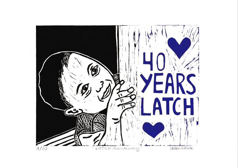
In this post I am sharing with you how I designed and printed this 40th anniversary lino print for the Welsh children’s cancer charity LATCH.
Finding inspiration for the 40th anniversary lino print.
Since July last year I have been working part-time as an administrative officer for LATCH. This charity helps families whose children are suffering from cancer. The support our families receive ranges from financial and psychological to very practical support such as filling in complicated forms such as DLA applications. This year LATCH is celebrating its 40th anniversary and I felt inspired to design this lino print. My idea was to create a smiling child with simple lettering.

My husband and I don’t have children, so the next best thing was to look for royalty free images on Pixabay. One image showed a toddler looking around the corner. I used this as the basis for the design. The challenge was to translate this design into something that I could carve into lino. My first attempt was not very good, but it helped me to refine the design. The trickiest areas were the hand, eyes and mouth.
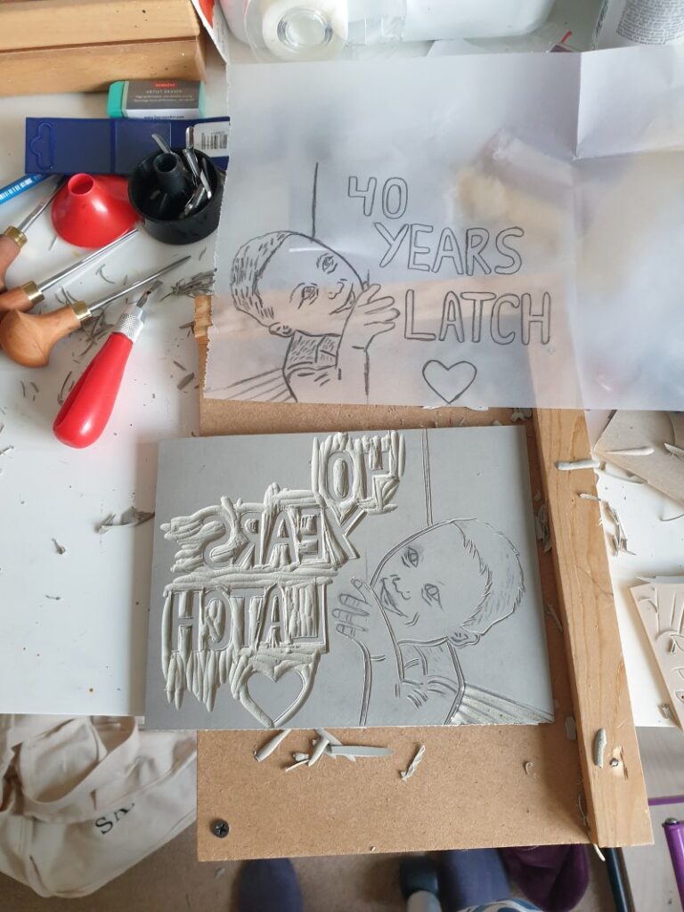
Three attempts until I was happy with the design.
With my second attempt I started with the letters first, but messed up the face. Both of these two initial blocks were grey lino blocks and I don’t normally work with those. It’s easy to slip up and it takes a lot of practice to get used to this type of lino block. For my third and final attempt I have used Essdee softcut. I painted it with red acrylic paint first and then I transferred the design.
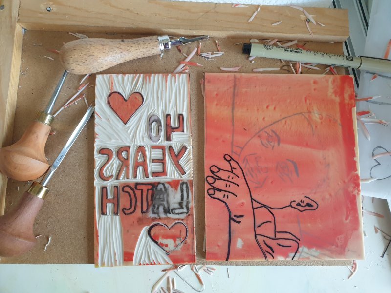

To make the printing easier, I cut the block into two halves – one for the letters and the other one for the boy. I used my Pfeil cutters and my Abig cutting tools. The letters were quite challenging too as it’s not easy to clear the inner parts of letters such as A or R. After my first test print, I refined the areas and changed the finger nails. They were black in the test print version.
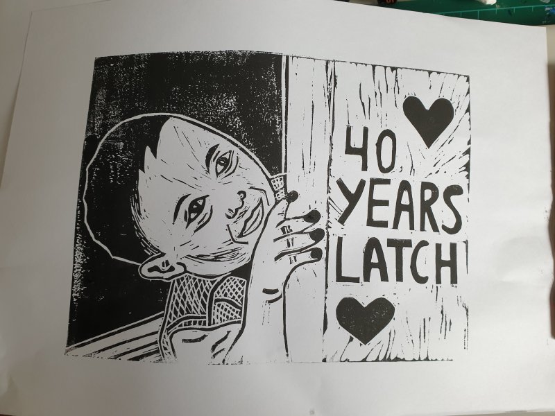
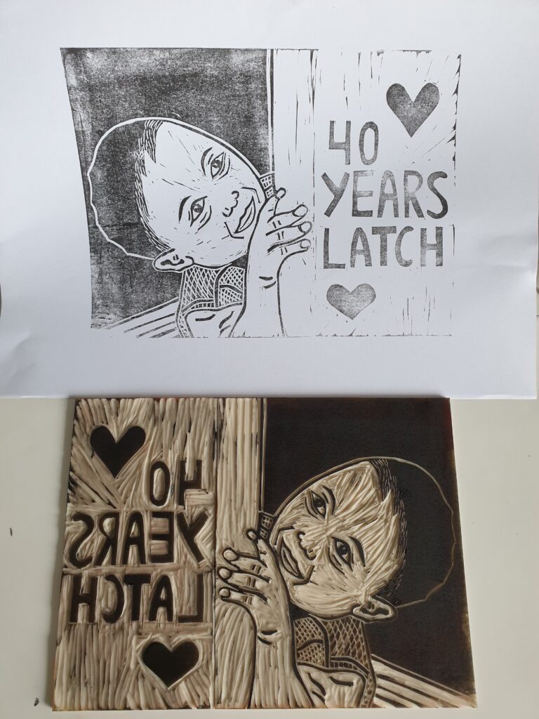
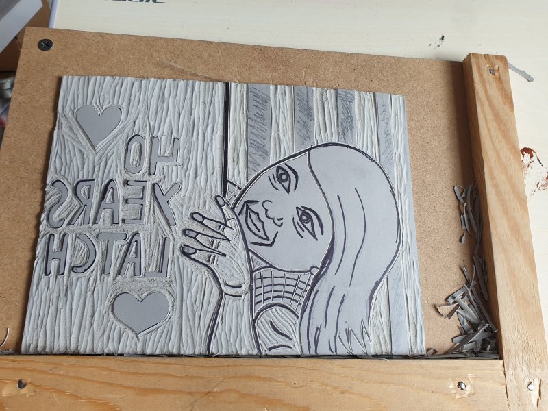
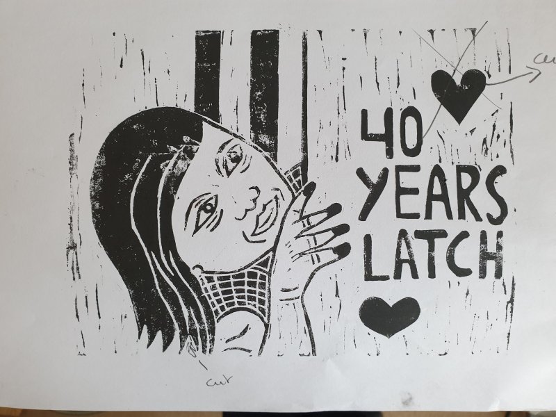
Creating a version with a girl.
I then created a version with a girl, but I didn’t like it. It just didn’t look right – I based it on the boy but added long hair. I showed my colleagues and they agreed with me that the boy version was the better design.
Printing with three colours.
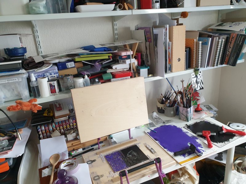
Printing the design posed a new challenge as I haven’t really printed in more than one colour before. I wanted the letters in purple, as that’s the brand colour for LATCH. The Caligo Safewash ink that I bought is very dark, so I had to add white ink to it to lighten it. As you can see on the images I had to work with very limited space.
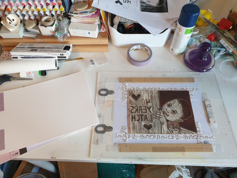
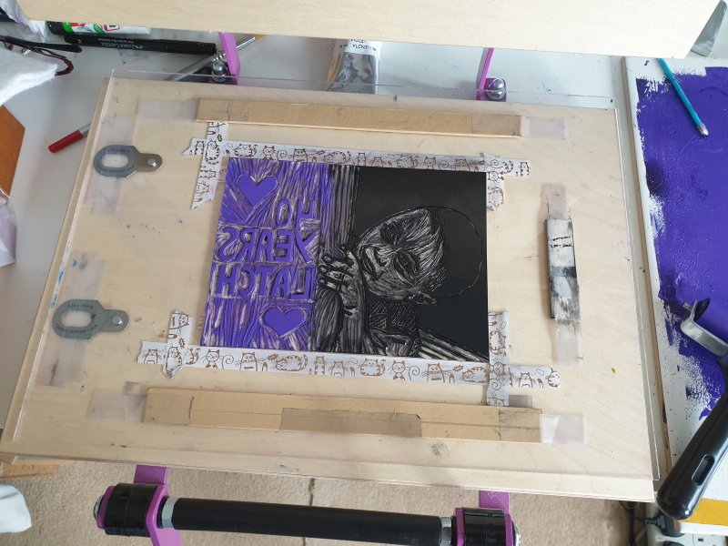

I messed up several prints by either putting to much ink on the block or not enough. The softcut doesn’t ink that well – certainly not large areas, such as the hair of the boy. I had to go over it at least twice sometimes several times. I don’t think I will use this type of block again, but use the more expensive Speedball instead.
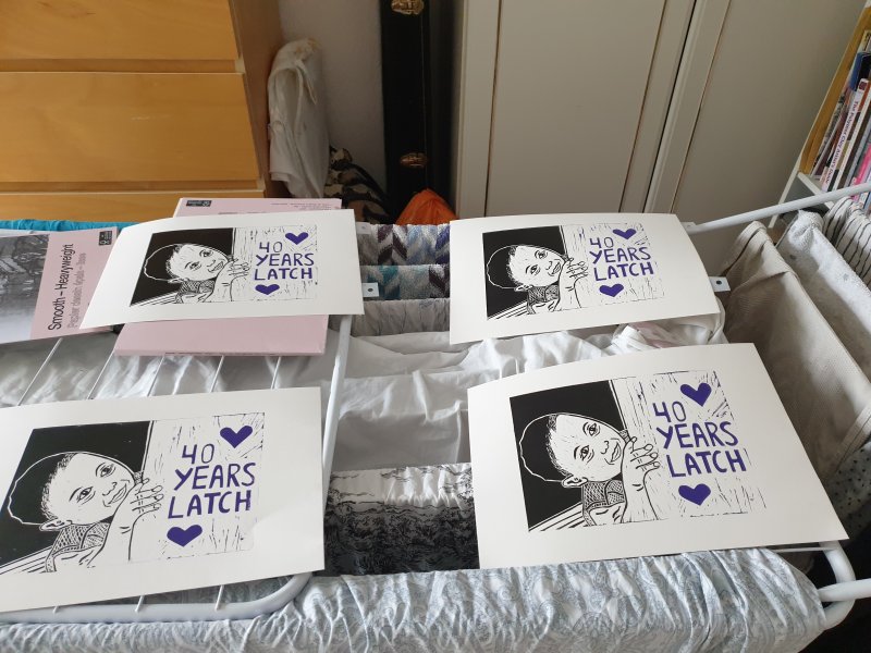
In the end I have managed to create an edition of 10 prints and I also have a few imperfect prints as spares. The prints are now available on the LATCH website. If you would like to support a worthy cause and own an original lino print click on this link here.
Thank you for reading.
Helen x