
My complete website makeover.
In this post I am sharing with you why I wanted a website makeover, what has changed and my 10 top tips for your website makeover.
Last year when I took part in the Leverage Your Art course, I realised that I wanted a completely new look for my website. My old theme served me well for a while, but it started to look a bit dated and I wanted a fresh new look and a website that attracts more visitors. I have also done a website audit which pointed me to things that could be improved. I already had my new logo and made a few changes to the homepage, but to me that was only tinkering at the edges. I wanted something more impactful. Sadly, my web-designer and friend Pippa Haines, who helped me with my last websites (she also designed my tuition website), passed away last year and so I ended up doing the work myself.
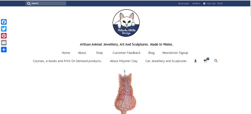
The first job of my website makeover was to find a theme I liked and was flexible enough to customise it. My theme from Kadence only offered limited customisation. I didn’t want to pay a monthly subscription, but buy something with a lifetime licence and decent support. After asking other people about their recommendations, I ended up choosing Themify, bought the lifetime bundle and installed their Shoppe theme.
I also looked at fonts I liked and were widely available, and websites I liked to give me ideas of how I wanted my new website to look like.
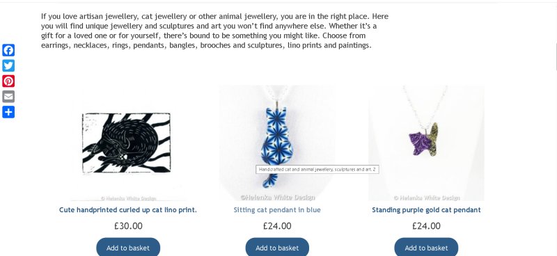
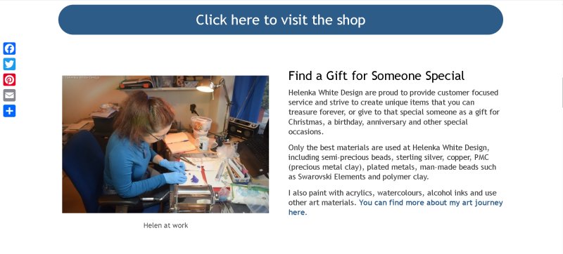
The next step was tidy the old website – I deleted images and a lot of very old blog posts I didn’t want to carry over to the new website. My host, Dale Baxter, from Baxter Media, created a staging site for me where I could start designing. Login into the staging website occasionally proved challenging, as it occasionally got stuck in verification mode.
A steep learning curve
While I am used to maintaining my own websites and updating plugins and making minor changes to an already existing theme, I have never really started a website from scratch and at first, I felt overwhelmed. While “Themify” provide tons of tutorials for their various themes and plugins, those were good for getting started, but I needed a lot of help from the support team. And luckily their support is excellent. They are very responsive even at weekends and go out of their way to help you with problems providing mini videos or screenshots and CSS code for whatever you need.
Slow progress.
Designing this website took longer than planned. Here is why: I have been working full-time at the hospital and was too tired to do any work after work. My day job required me to work with two screens and various applications, so by the time I came home, my eyes were extremely tired. Which meant that I could only work on it at weekends and during my annual leave. I also had to wait for my host until he was back from his holidays to make the switchover.

The main changes I made to my website.
For my new website I picked specific fonts (mainly Poppins and Playfair Display) and a colour scheme that is inspired by my new logo – which has a dark blue, pink, a salmon like colour, green, white and black. I figured out the hex codes of my colours and a variation of their hues in Procreate and wrote them down. I used the colour scheme in the text boxes and you can see a variation on each page I created. I created each page from scratch using the Themify builder. That took a while to get used to, as the original website was mainly using the classic WordPress editor. Each page has a distinct look, but the fonts are all the same.
I deleted a few pages – such as commissions, as I currently can’t offer the service and the page that shows all my YouTube videos. And I have merged my jewellery and art story pages into one long about page. The homepage now highlights info I want to show with link buttons to go straight to the pages, I have added a sign up at the bottom and a slider with a few selected customer reviews.
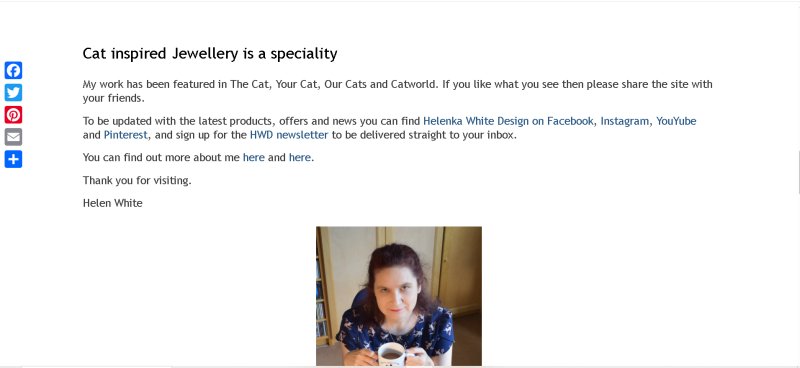
I was thinking of changing the photo of myself, but for now am keeping it as I find having photos of myself done really difficult.
The pop up is now designed with the Themify builder, replacing the Mailerlite popup. This is in keeping with the website’s overall design.
I haven’t really made changes to my blog posts as I didn’t want to start each post from scratch. These posts were all build with the classic editor (very old posts) and Guttenberg and if you want to redesign those, you have to basically delete and then use the builder. As I have a lot of posts, I just didn’t want to spend all my time an energy on this. However, a CSS code, which the support team provided to me, helped with the font and justification of paragraphs in the posts.
I can’t think of any other significant changes I made, probably the shopping cart and payment options have changed. I personally hope that this new website will provide a better experience for my returning customers and will attract more visitors.
If you want to change your website to something completely new, then read on..
My 10 top tips for your website makeover:
- Figure out what you want it to look like – research websites in your niche or get inspiration from websites you like.
- If you are using WordPress, you will notice that there are loads of different themes out there. I ended up spending ages reading reviews, comparing prices and also asking other people for recommendations. I wanted something that is easy to use, with reliable support and a one-time payment. I hate paying for subscriptions (with the exception of educational websites).
- Explore fonts that you like for your website. I spent a while reading blogs about fonts that work well together and are licence-free. If money isn’t issue you can splurge on a font you like. There are plenty of font designers out there.
- Colour scheme. Figure out which colours you like – or let your logo determine your colour scheme. My colour scheme is based on the colours of my logo plus one colour (the gold) that came with the theme.
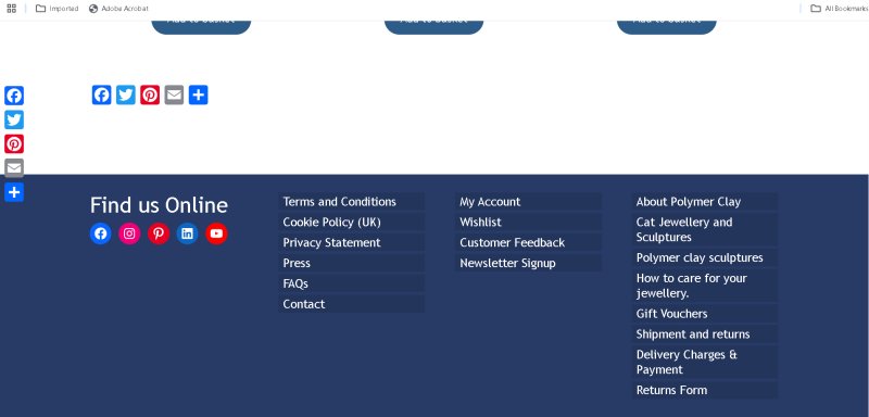
- Make sure the top menu showcases what you offer on your website and use the bottom menu for all other useful and necessary information such as T & C’s, FAQ’s etc.
- Don’t forget to add a cookie notice and your privacy statement!
- The homepage is the first page your visitors typically land on – make sure it showcases your work and any information that you want the visitor to see. That includes a pop up for your mailing list and a selection of reviews. You can always change it up with new offers.
- If you are stuck for ideas on how to design your homepage -ask Chat GPT for help – I am not a fan of AI (especially AI art), but it can come in useful for getting ideas. Obviously, you don’t want to use the ideas verbatim and adapt it to your own style and tone.
- Test your pages in tablet and mobile phone view, to make sure it all looks fine. I had to make a few changes in mobile view.
- Test your website in different browsers and make sure to back up your old website (in case something goes wrong).
I hope you like my new website and found this article useful. Please leave a comment and share, if you like.
Helen x