
My new logo design
In this post I am sharing with you the evolution of my new logo design.
A few months ago, I bought a refurbished iPad and the painting program “Procreate” to teach myself digital painting. I have also joined Liz Kohler Brown’s membership “The Studio” to learn different techniques and how to create patterns. I decided to create a new logo, as I wanted a bit of a business makeover.
My black cat logo served me well, but creating it wasn’t easy and involved drawing the logo, scanning it, filling it with colour using an ancient version of Paint Shop Pro, finding a copyright free font and also using PowerPoint. As I am already learning how to use Procreate, I thought this is a good opportunity to create my new logo. For this I created a few designs that I like to show you and of course the final one I have chosen.
Keeping the cat theme in my design
I wanted to keep the cat theme as cats are such a big part of my life and my business, so I have chosen photos of our cats Lucy & Max as a basis for my designs. I also wanted to use the blue from my website as one of my colours and create my own lettering, which was made really easy in Procreate, as I could save various versions and play around with them. I turned the lettering into stamps which is handy, as once you have created them you can use them in your designs and change the size and colour.
I also wanted the logo to reflect that my business is an art business – this is my new direction I am pursuing and I wanted to showcase this with my logo.
My different design ideas
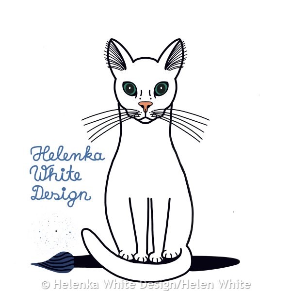
My first idea was this cute cat sitting on a paint brush- the paint brush representing, that I am an artist too. For the font I used different versions – block lettering and lettering that is more like brush lettering and school hand writing. I also changed the colours in the various designs as you can see and I also created a version with fur and without the fur.
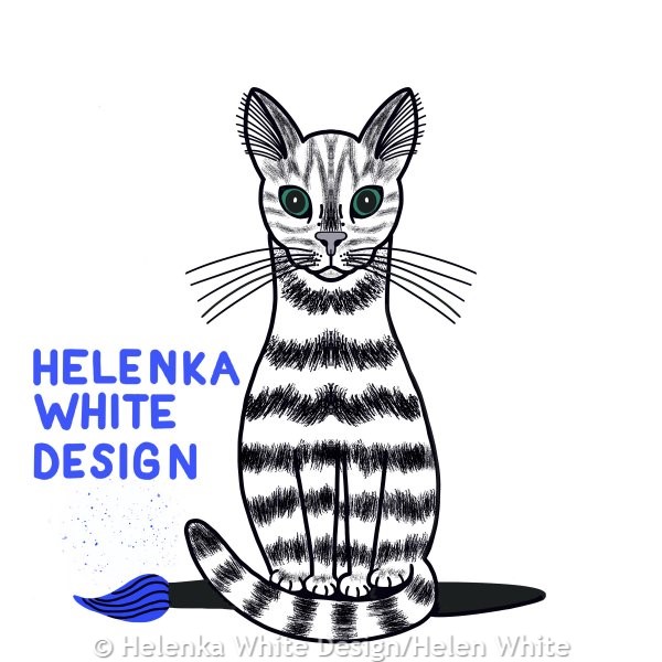
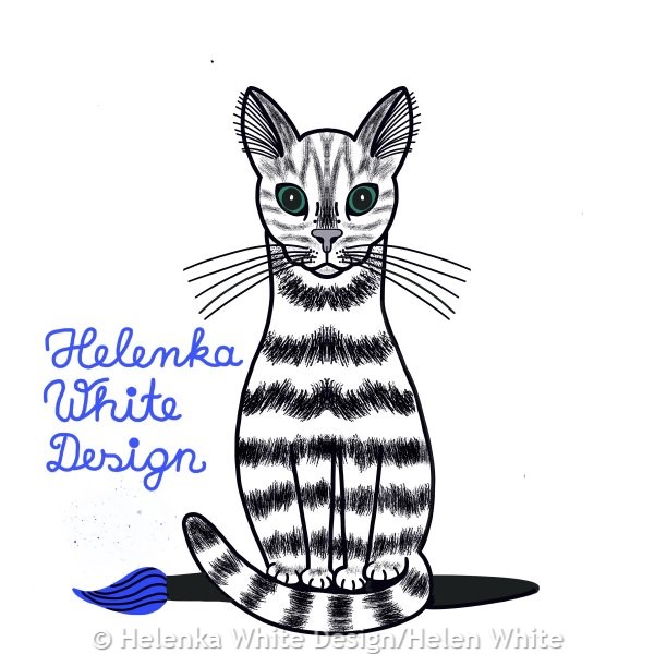
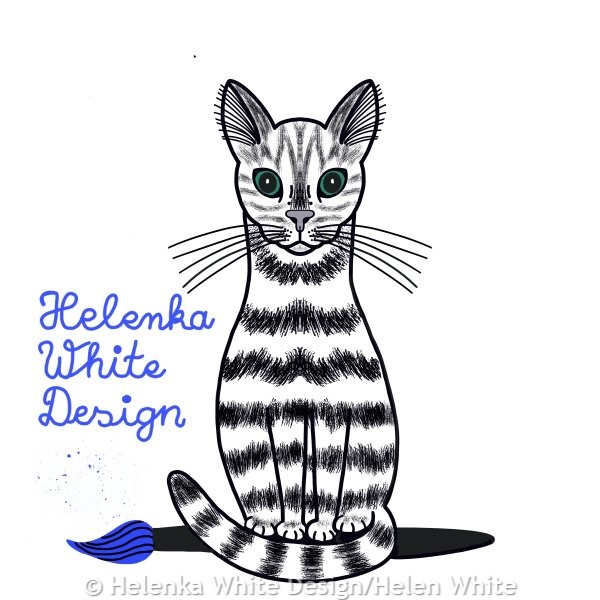
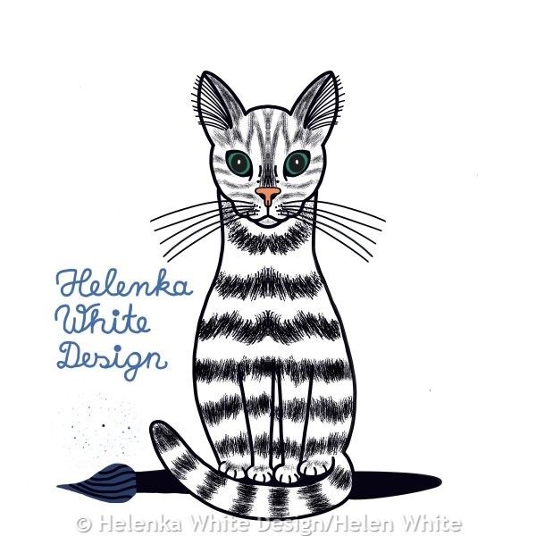
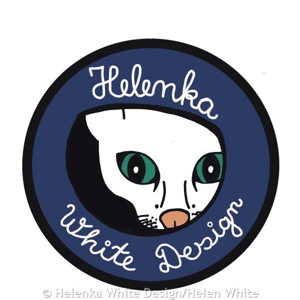
The next two were based on photos I took of Lucy peeking through one of our cat toys which has a few holes. I really liked that photo and also like this logo design. Again, I created one version with fur and one without.

I quite like having the logo in a circle so I used that concept for the next design which is also based on a photo of Lucy. Here I also tried different lettering versions.
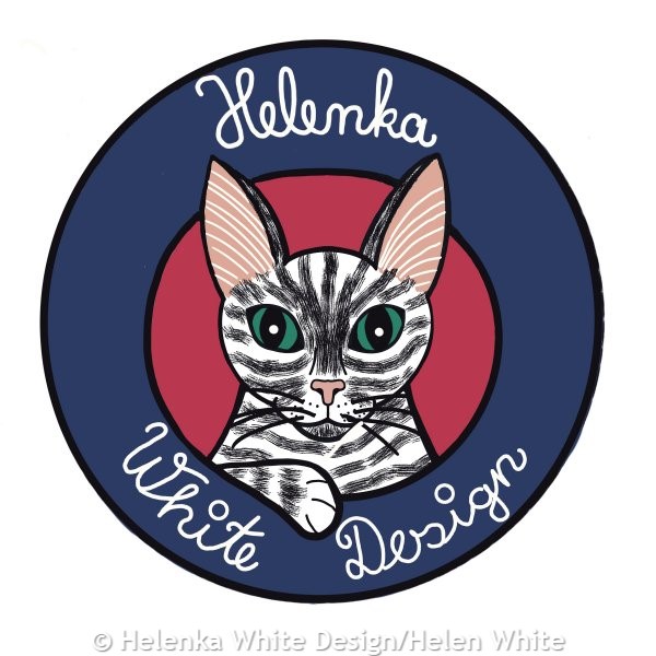
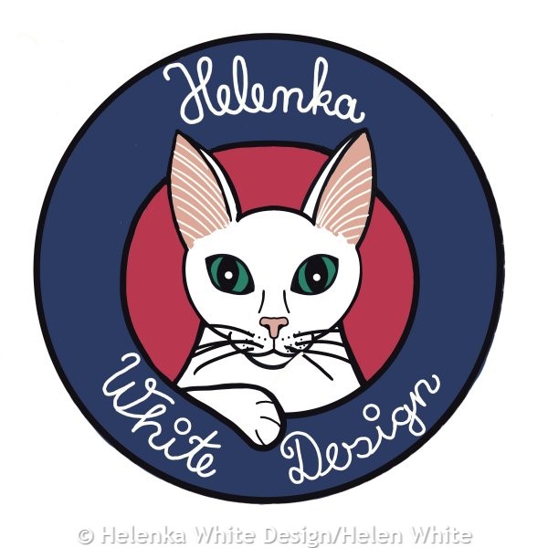

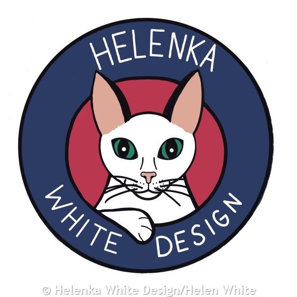
My final design.
My final design and my new logo below are based on a photo of Max. He loves to sit on our sofa or armchair and dangle his paws over the armrest – usually the paws are both positioned neatly together. I just loved his relaxed pose here and his expression, so wanted to use that for the logo. Originally, I didn’t plan it as a circle, but a fellow member in The Studio suggested to put a circle around it and I think it looks better.
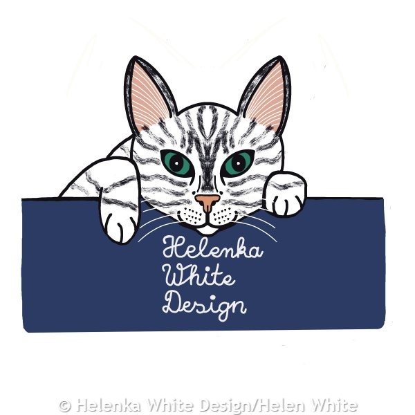
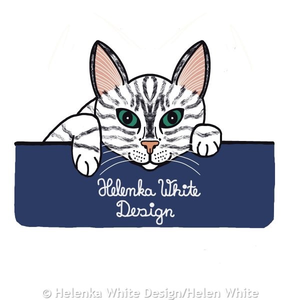
Again, I played around with the lettering and fur versus non fur version. While I prefer the fur version in all of my designs I had to go without the fur – simply because too much detail can make reading the logo difficult when it’s small.
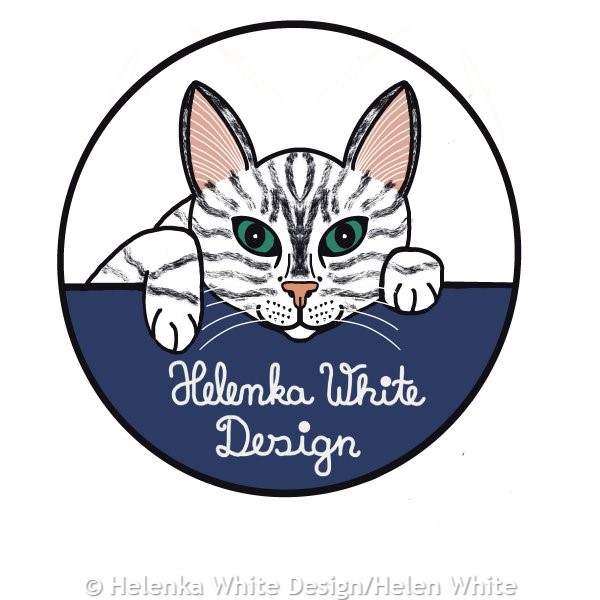
I have also shared my designs on social media and the consensus was to go without the fur, though some people preferred block lettering. My other designs won’t go to waste though, as I will probably use them for something else.
I hope you like my new logo and understand the thought and creation process behind it. I will slowly phase out my old logo, so for now my business card still has the old version. Once I need to print new cards, I will replace it.
Thanks for reading.
Helen x